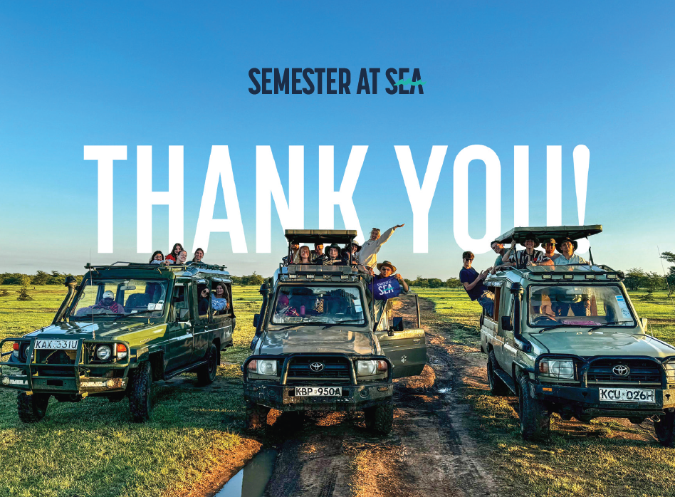
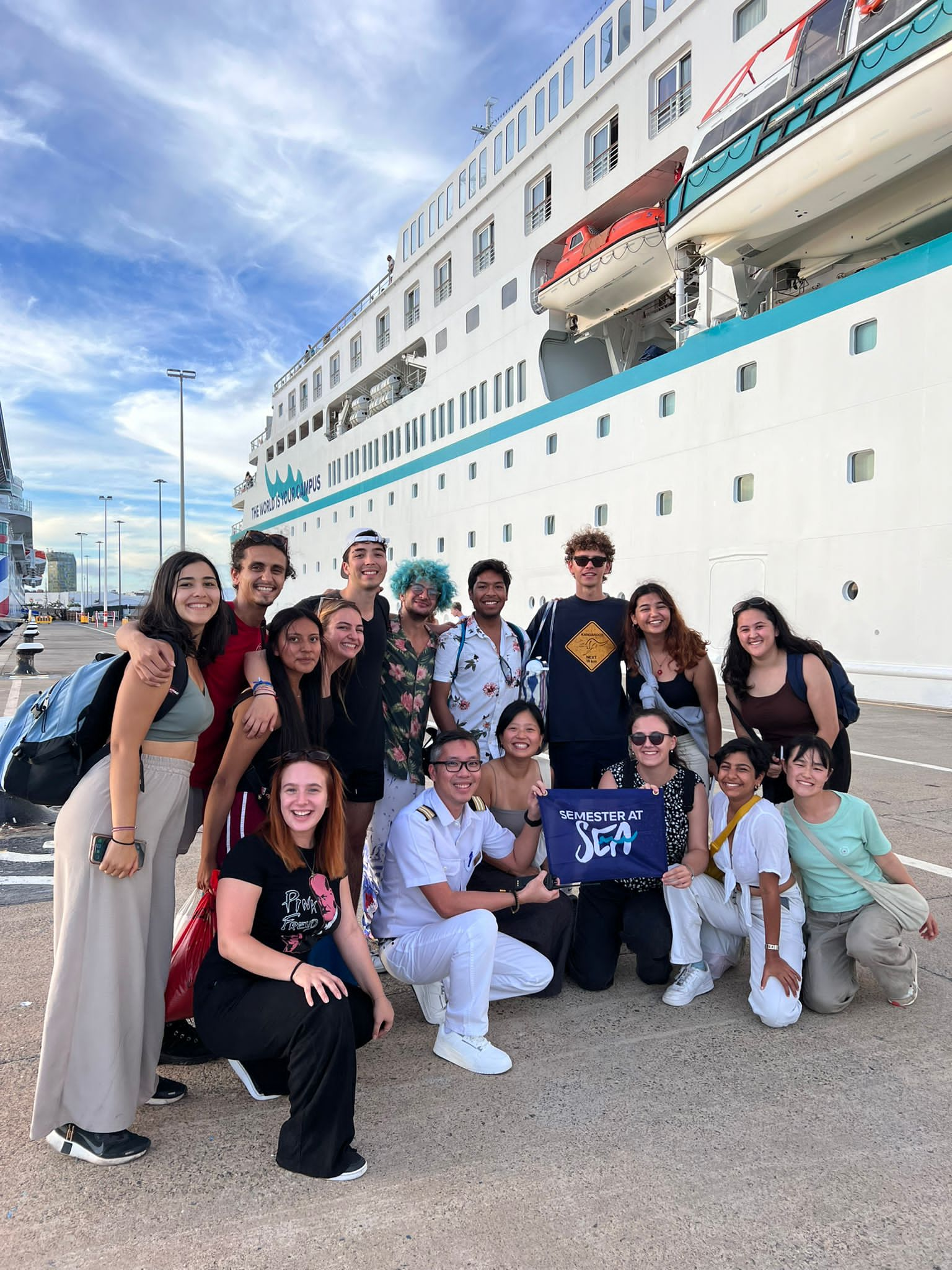
Semester at Sea
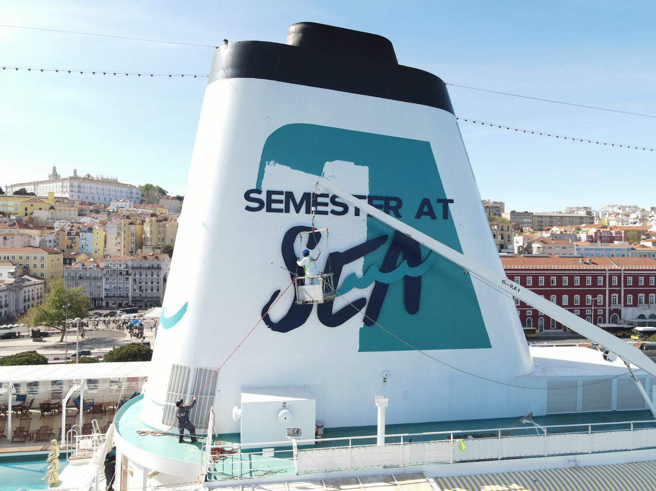
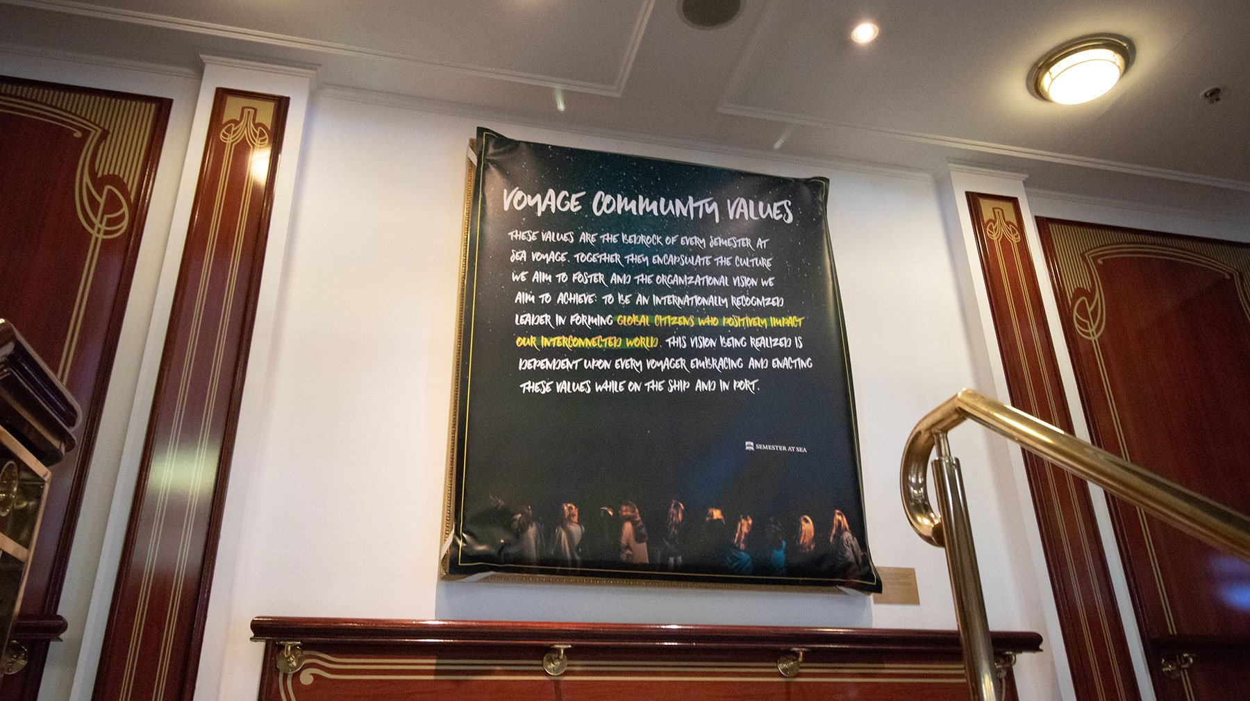
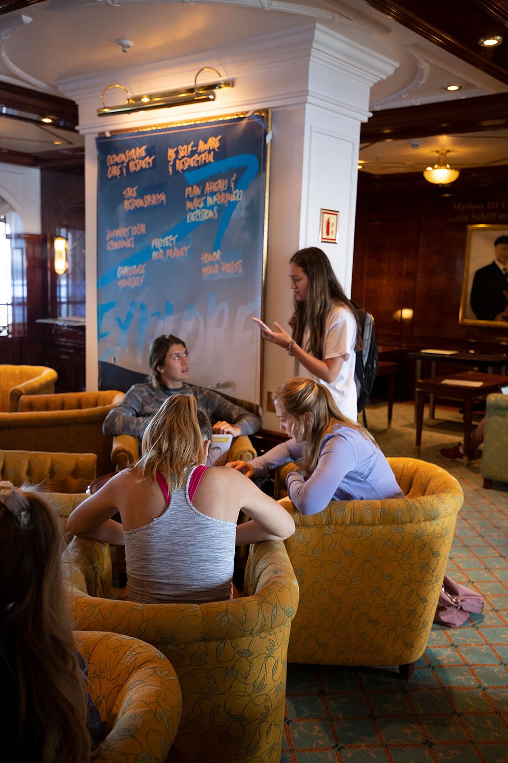
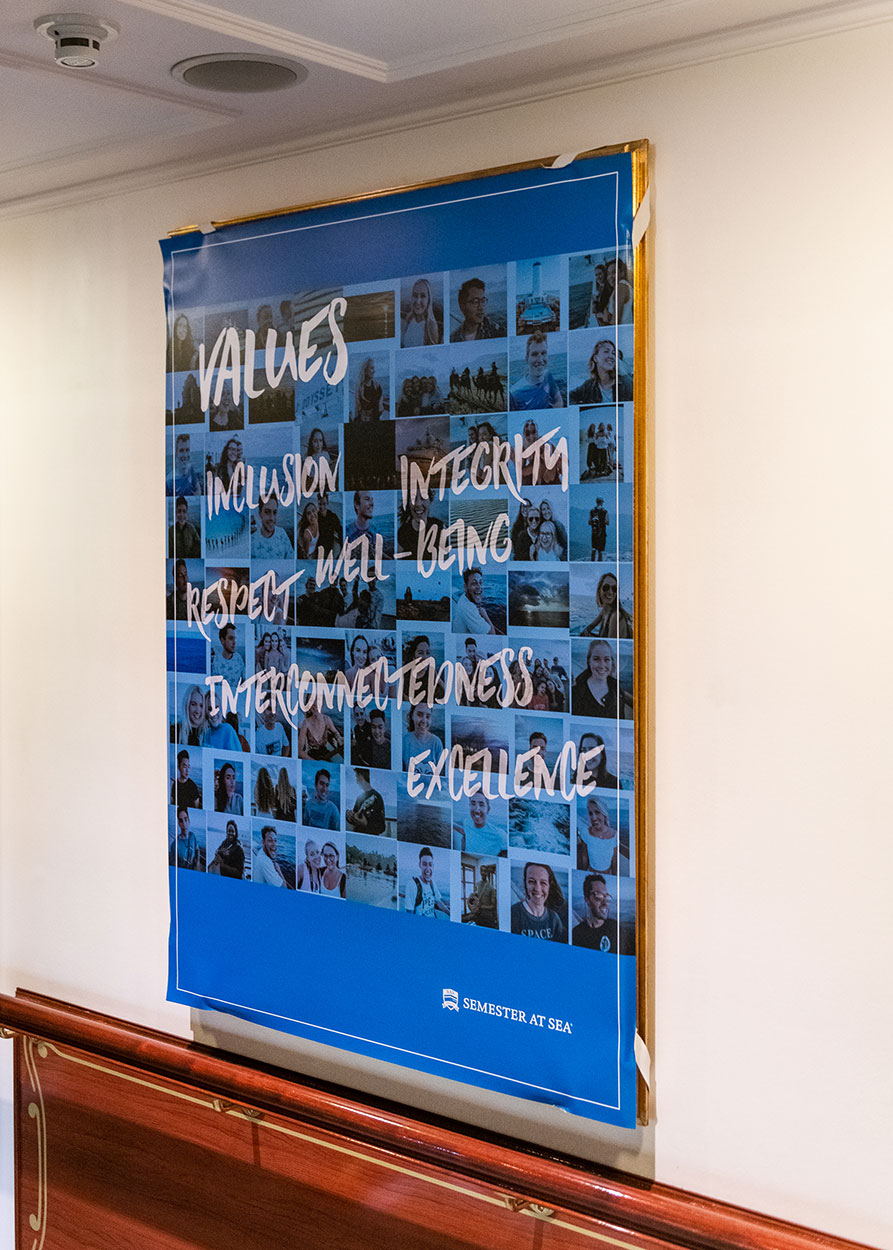
I attained a campus feel within the interior of the 9-deck, 600 passenger ship by innovating a way to display SAS graphics using dye-sublimated fabric format signage to cover existing paintings. Also achieved bold exterior branding of ship within maritime guidelines.
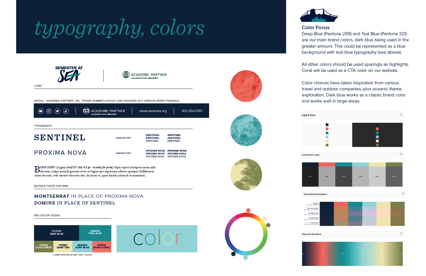
I developed Semester at Sea's new logo, colors, and typography. This is a visual brand language document to communicate their brand internally and externally. This shows my experience with brand development, management, and implementation.
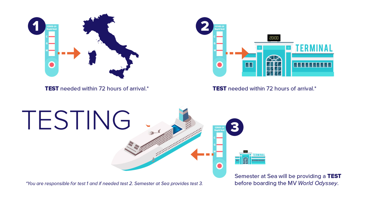
A COVID-19 infographic was needed prior to the Spring 2022 voyage to describe the complex process of testing prior to embarkation.
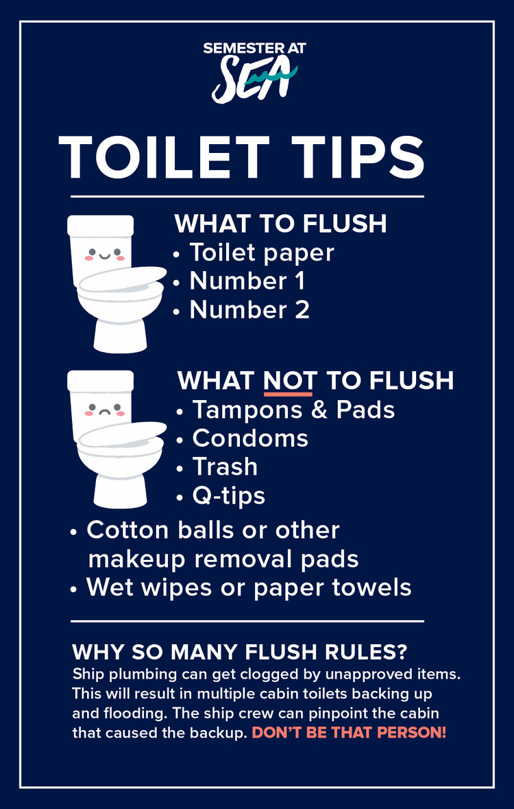
A simple mirror cling on the MV World Odyssey reminded passengers that one clogged toilet could affect the whole floor. Clear communication protected the health and wellness of the entire community.
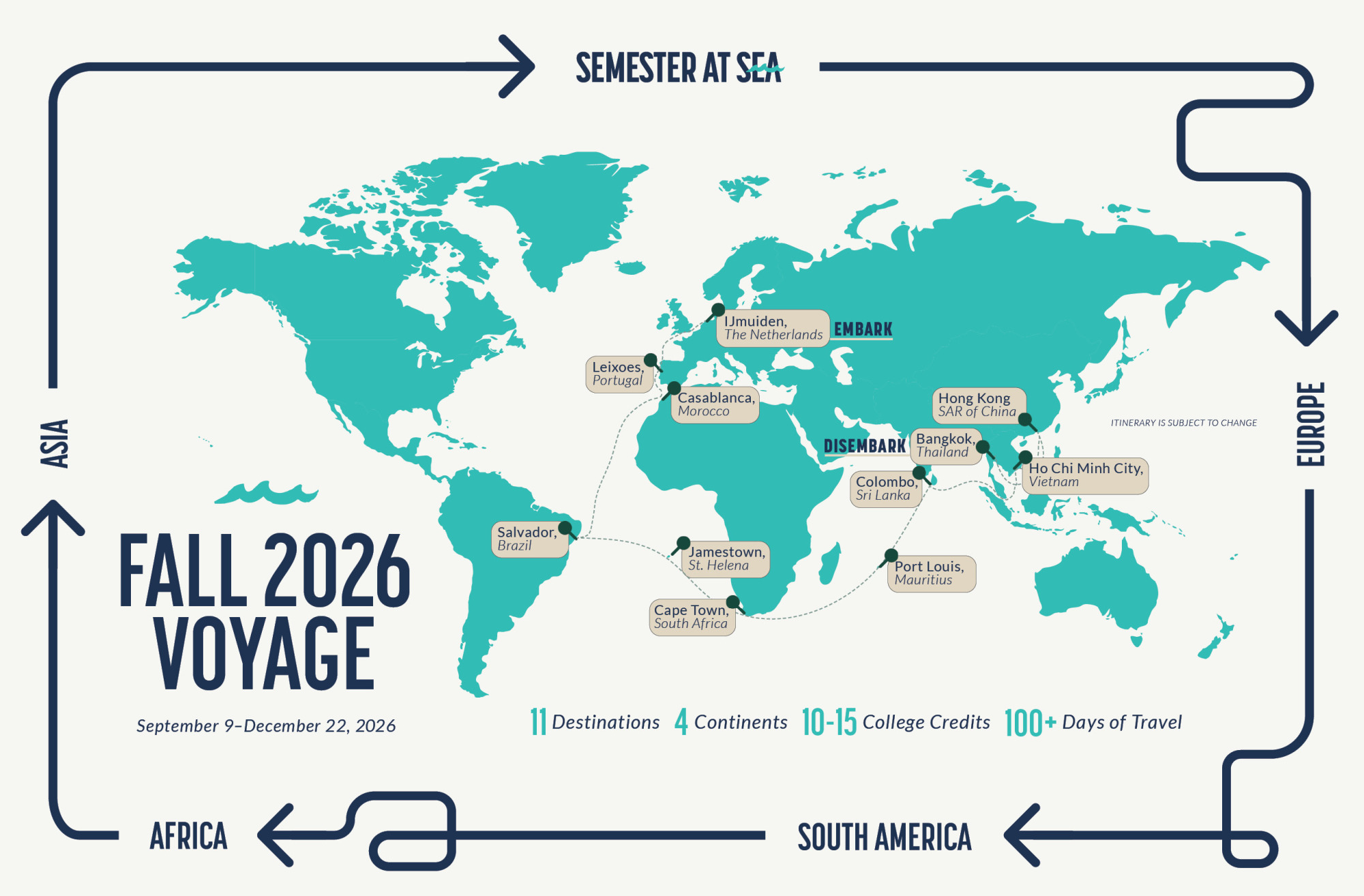
This is a redesigned voyage map that aligns with brand guidelines and presents the information in an engaging, clear, and easy-to-read format. As a flagship piece, it's prominently featured on Semester at Sea's website and is printed for sharing at various fairs across the globe.
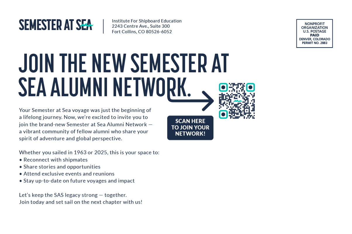
Alumni Network direct mail postcard.
I was part of a team that searched for our website design company. This included reviewing over 5 RFPs. After a finalist was received I communicated our visual brand and provided assets for the overall look and feel of the site.
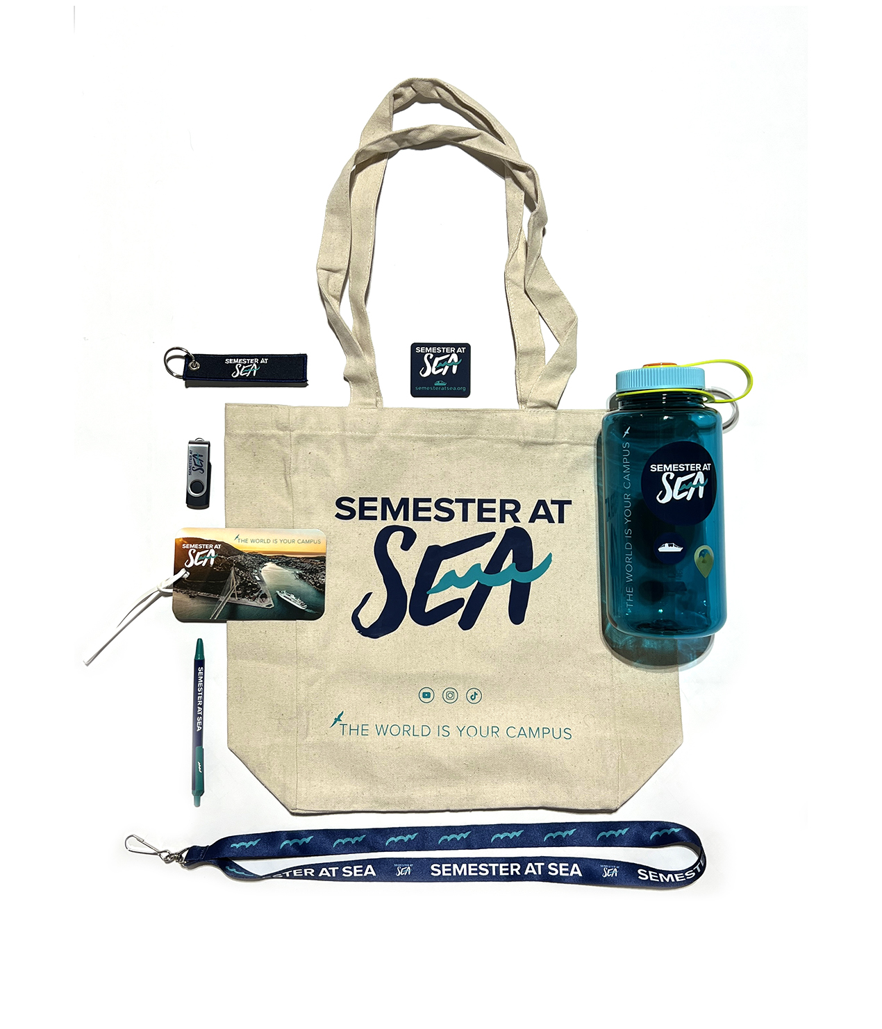
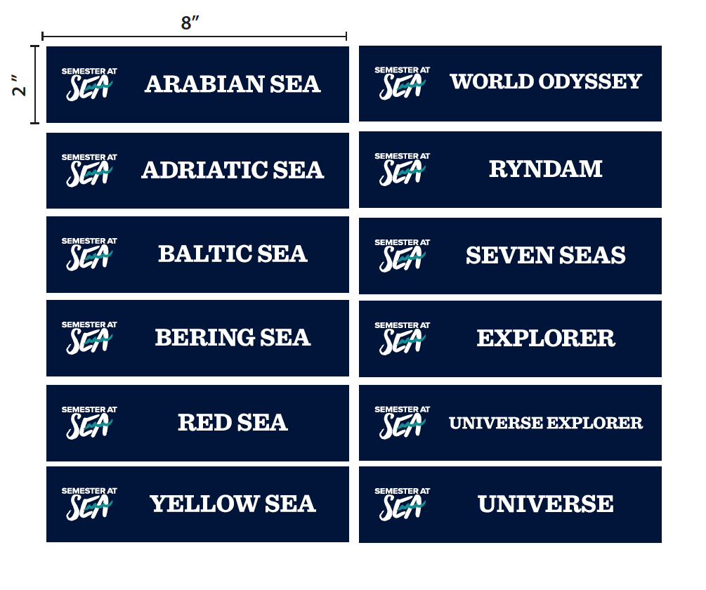
I have the right contacts and knowledge to get promotional products produced correctly. This is a sampling of recent products produced with multiple vendors for Semester at Sea.
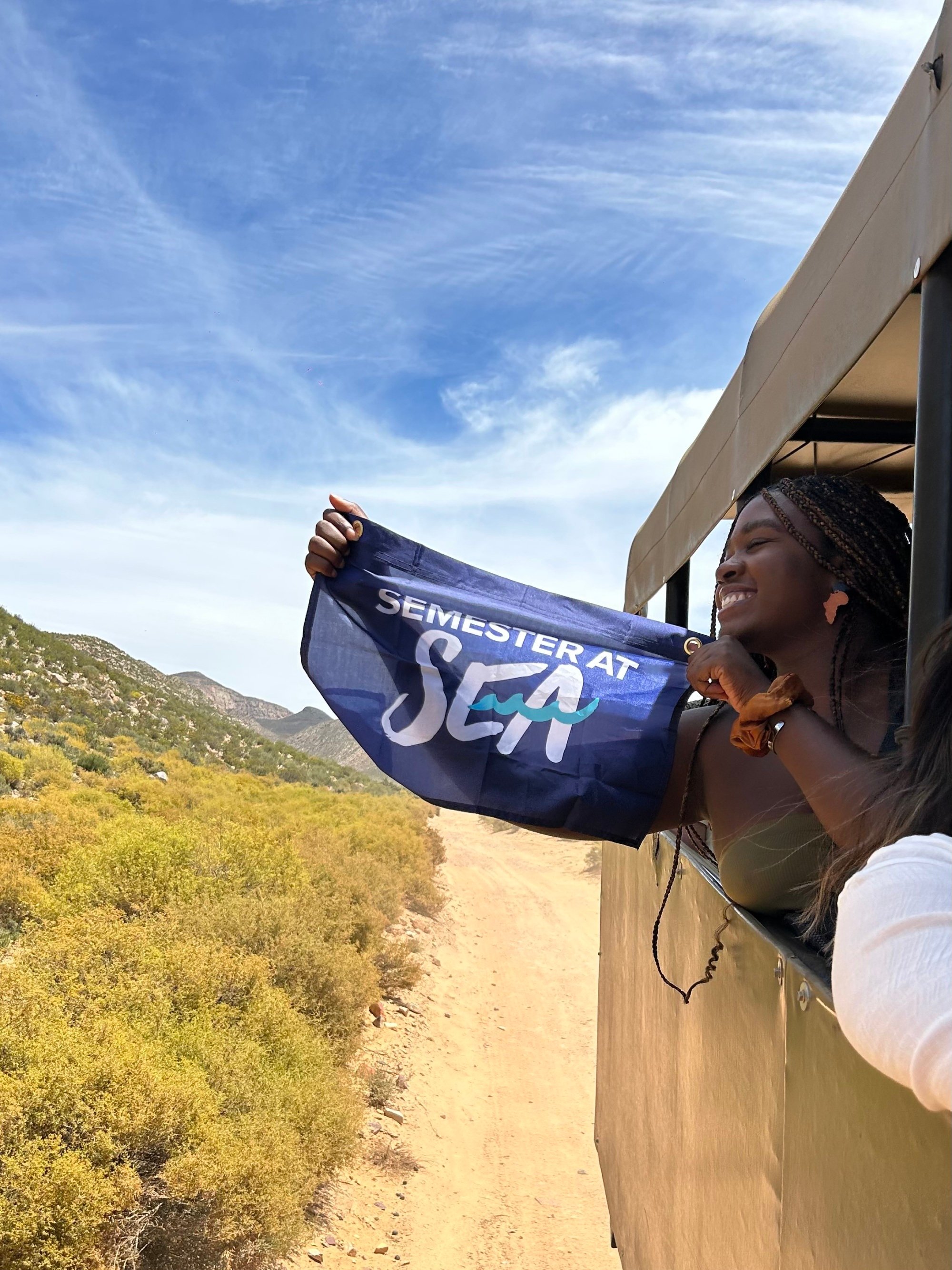
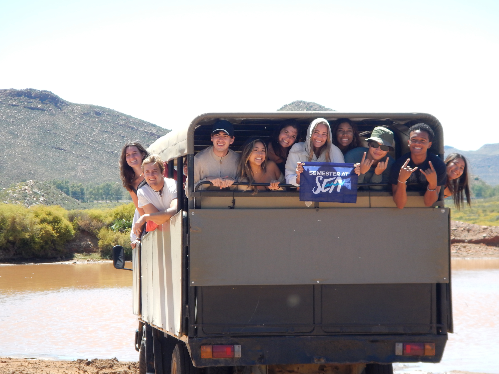
My logo design and branding for Semester at Sea are recognized around the world.
A diversity, equity, and inclusion focused shipboard poster that was produced on a plastic cling material that doesn't damage the glass windows on the interior of the ship.
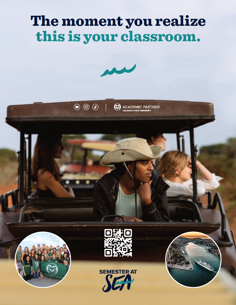
A print advertisement for multiple publications at Colorado State University. I came up with the headline that we have expanded to other marketing pieces. I have directed photography that fits with this headline for future campaigns.

Print and digital voyage maps which are offered at study abroad fairs with a QR code that links to Semester at Sea's voyage pages. Scans are tracked and analytics are reported out since these are the most visited pages on the site.
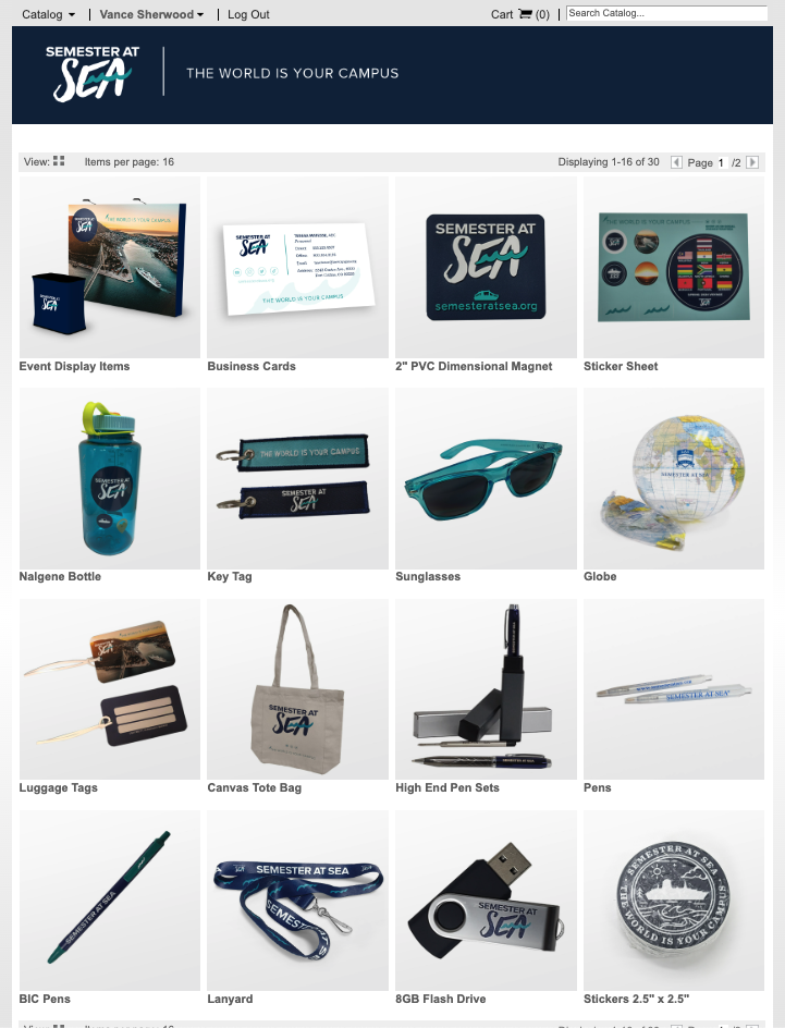
I led the charge to find our new distributor and develop a new online ordering system for our Regional Directors of University Relations & Enrollment and internal staff. I chose a local Colorado company that would aid communication and physical print proofing. I helped design and develop the online ordering system, and also produce all of the promotional and print items in inventory. I check in on inventory numbers weekly.
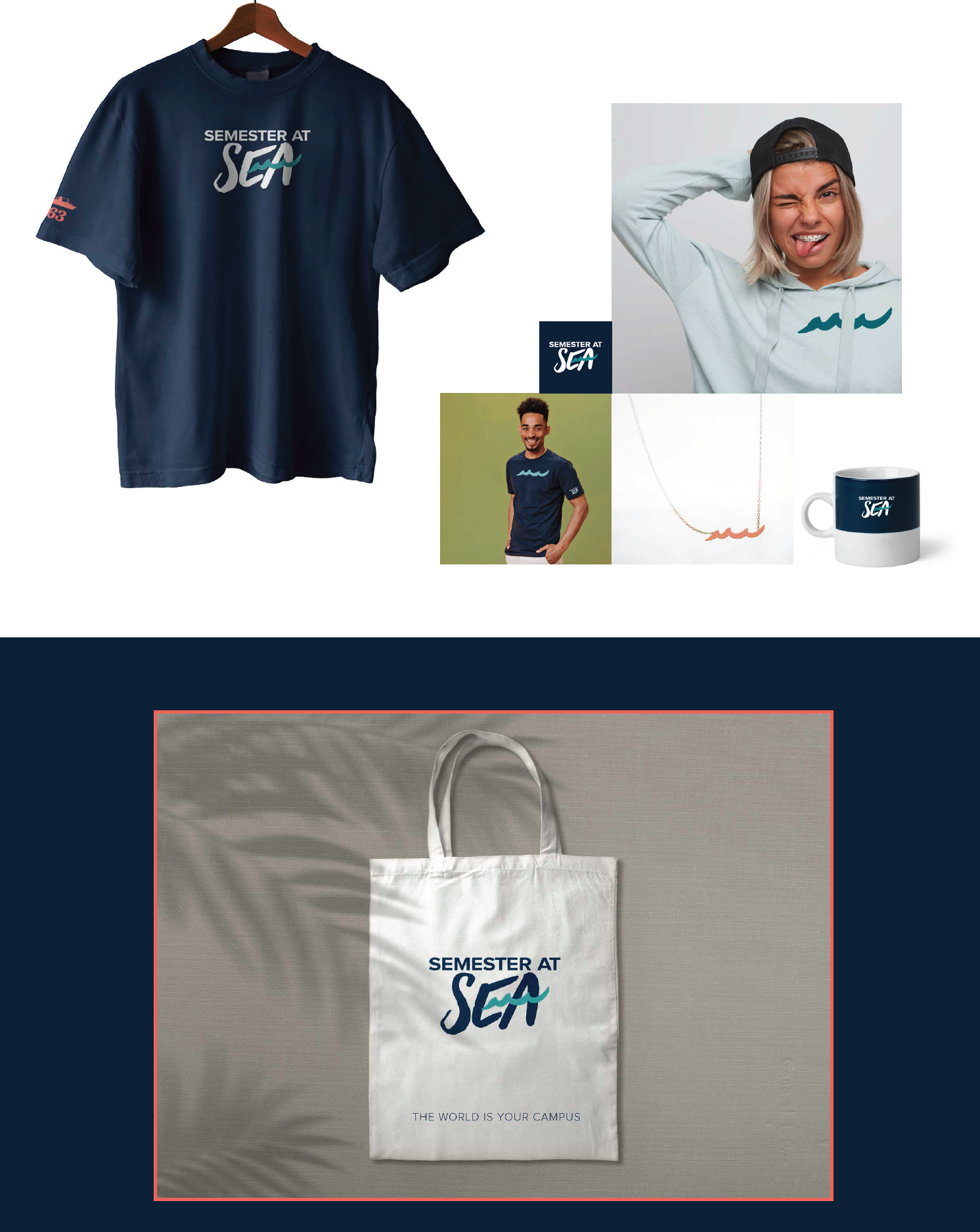
I presented these mockups to roll the new visual brand out during a retreat for Semester at Sea. Further iterations of these products were produced later.
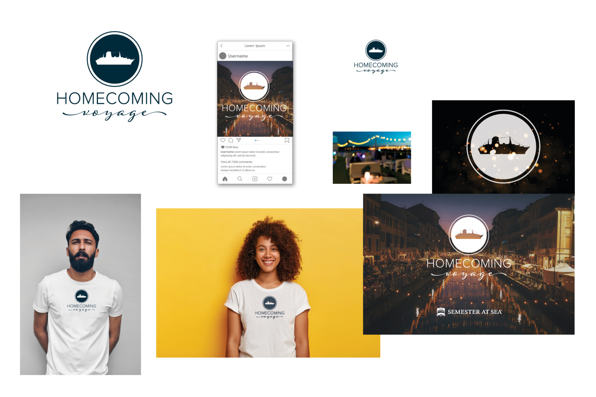
This is a Homecoming campaign mock-up that shows: main mark, social post, t-shirt, postcard.
Graphics for a Semester at Sea video advertisement on Hulu.
Graphics for a second Semester at Sea video advertisement on Hulu.
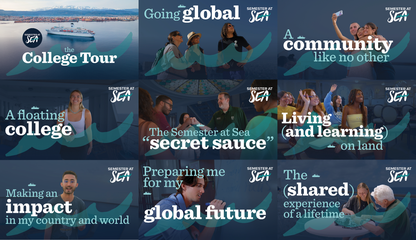
YouTube thumbnails that build a clear visual consistency with these short films that were cut down from a larger film that premiered on Prime video and Apple TV. THE COLLEGE TOUR
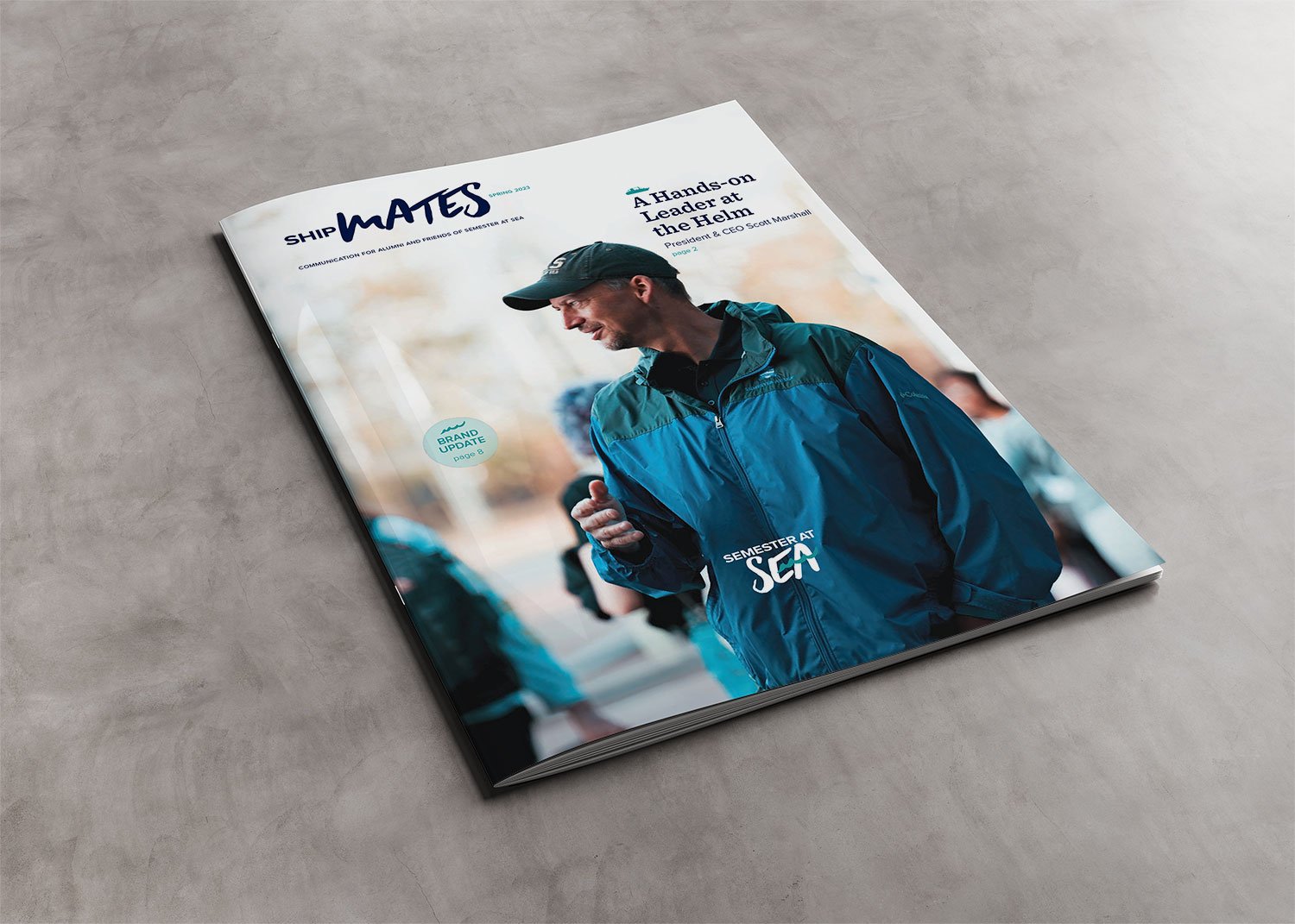
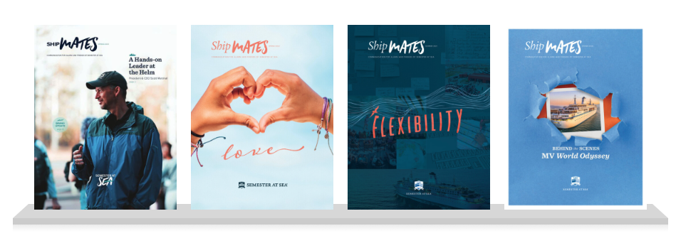
VIEW PUBLICATIONS I possess a long history of magazine design and print production. This includes insights into paper choice, coatings, and other considerations.
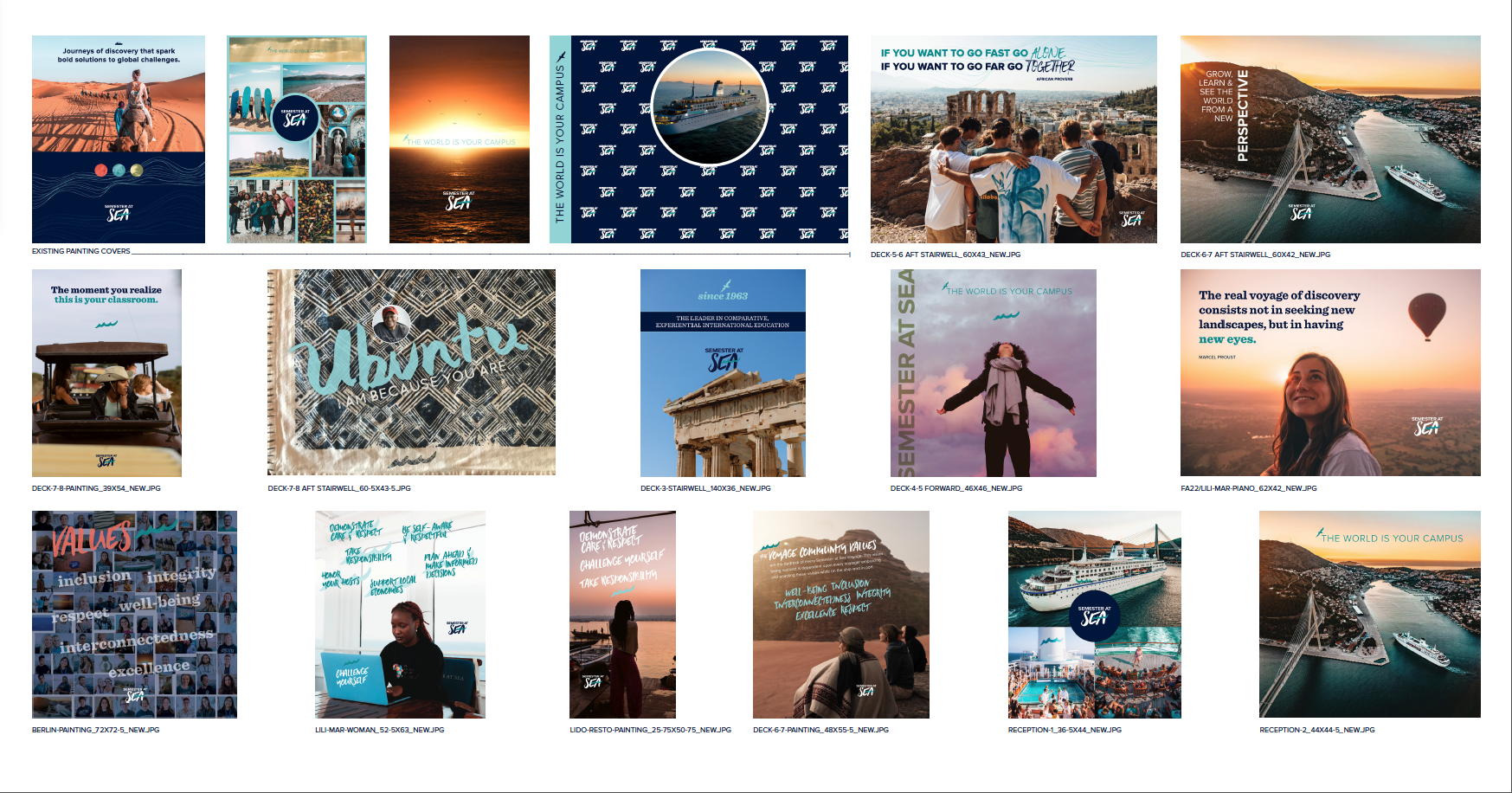
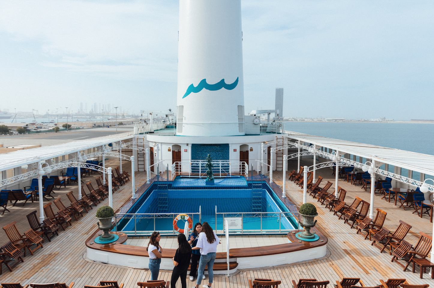
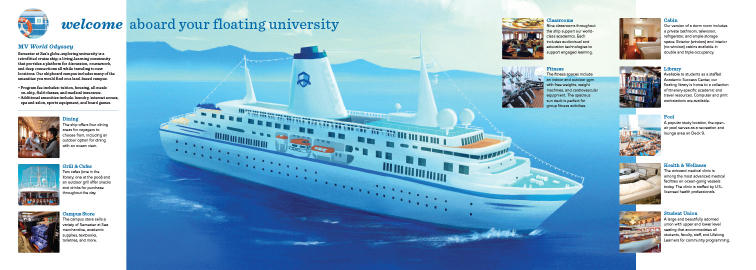
There are some odd paintings that students don't connect with on the MV World Odyssey. The paintings cannot be removed and it doesn't create a feeling of being on an academic campus. I came up with a solution to cover the paintings with graphics that wouldn't damage the paintings and make if feel more like a campus. Values of Semester at Sea's shipboard community were incorporated. The covers are a custom dye sublimated stretchy material that has elastic sewn into the outer edge that can pull tight like a hoodie around the edge of the painting frames. Current photos were a different format and these new designs will be the in the new format to debut Fall 2023 on the ship.
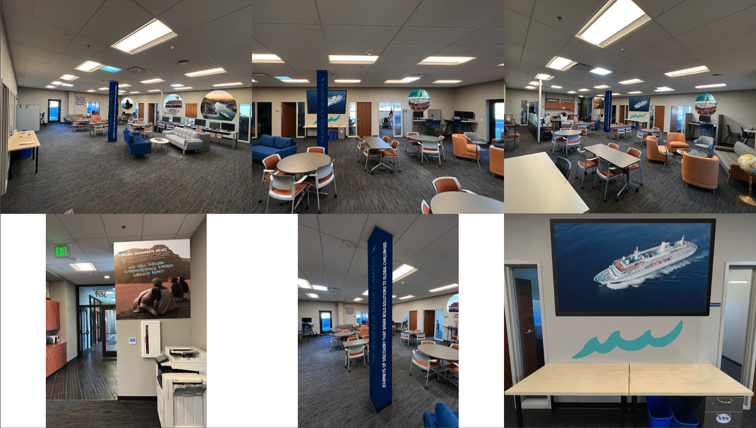
These are mockups of an office design that I produced for Semester at Sea. I worked with a local Fort Collins vendor to chose a matte vinyl that will not damage the walls when take off which was important with the lease agreement with Colorado State University.
Room signage as part of the Semester at Sea office design.

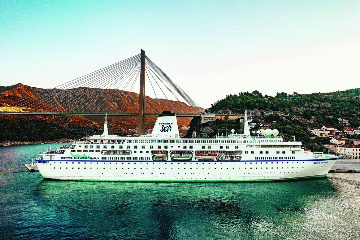
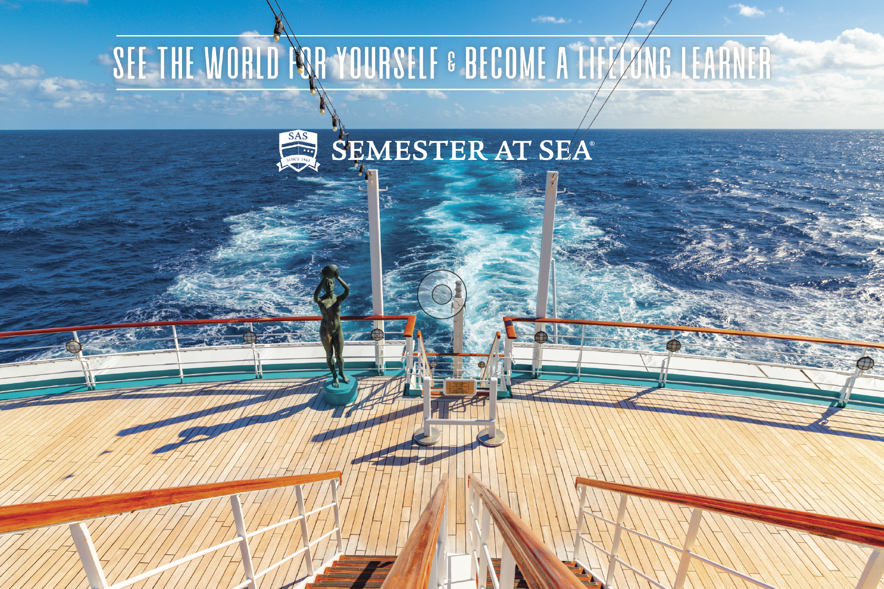
This illustrates my art direction with drone photography to achieve a breathtaking image.
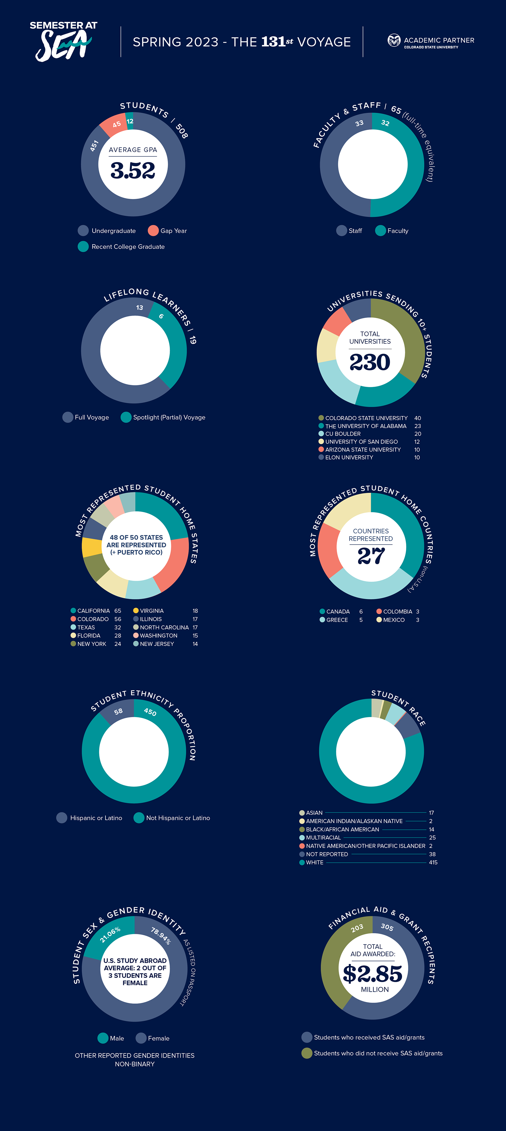
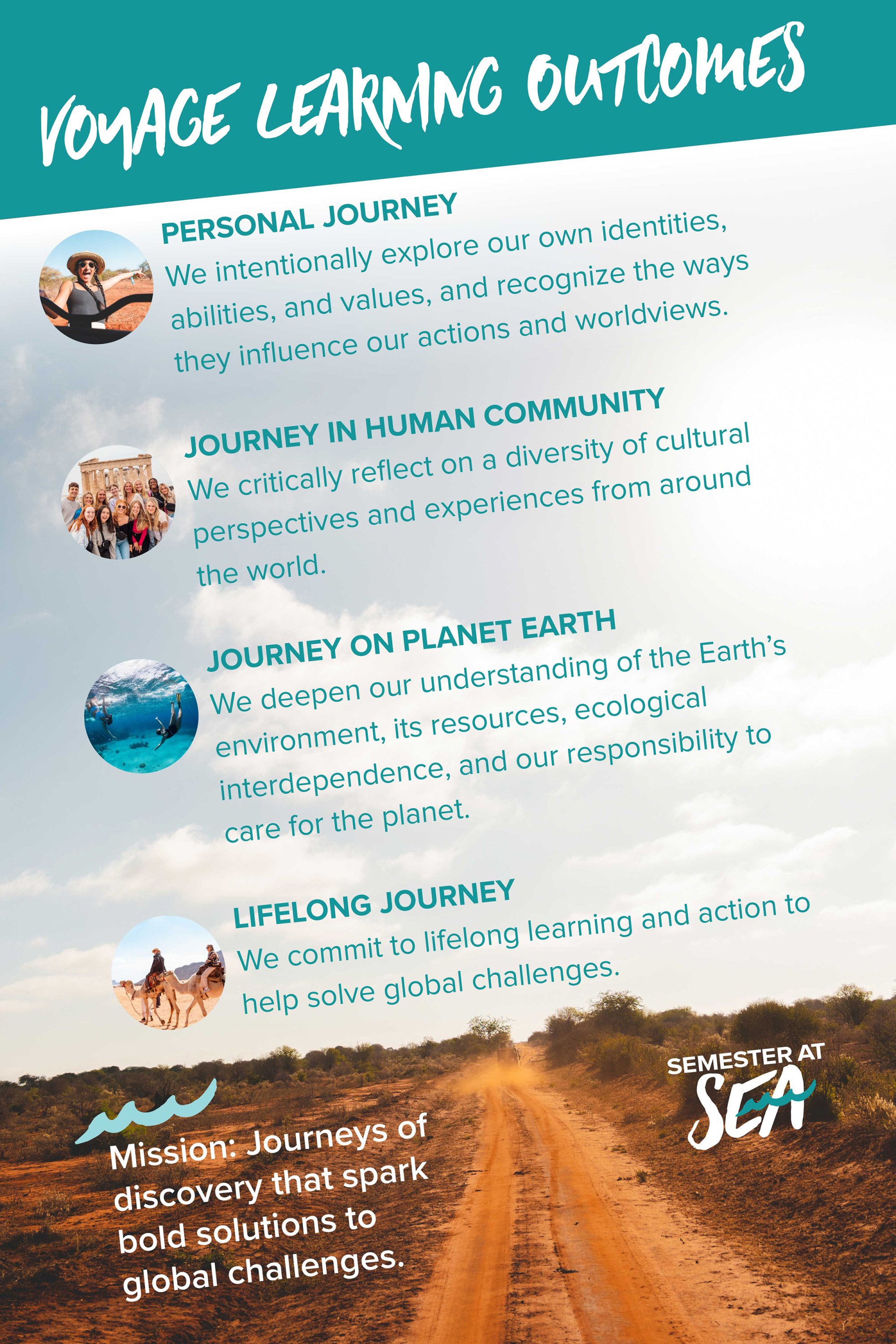
Voyage demographics designed in an infographic format that makes digesting complex information easy.

Backpack patch design for voyagers. This was expanded to the Sea Olympic "Sea" patches in various colors. I am working on this order with the CSU Bookstore and multiple vendors.
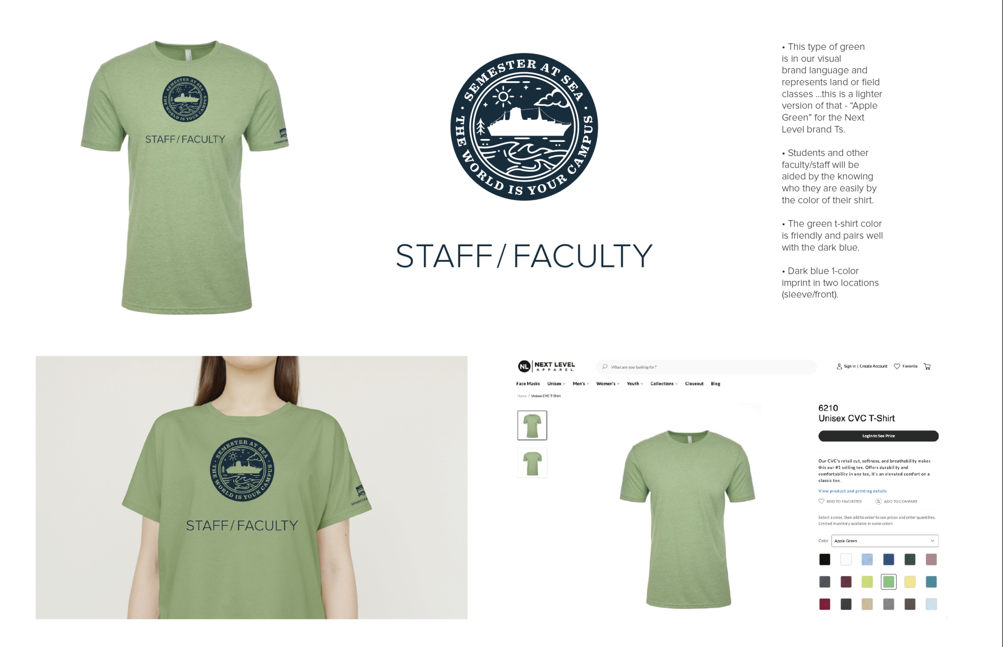
Staff and faculty t-shirt design.
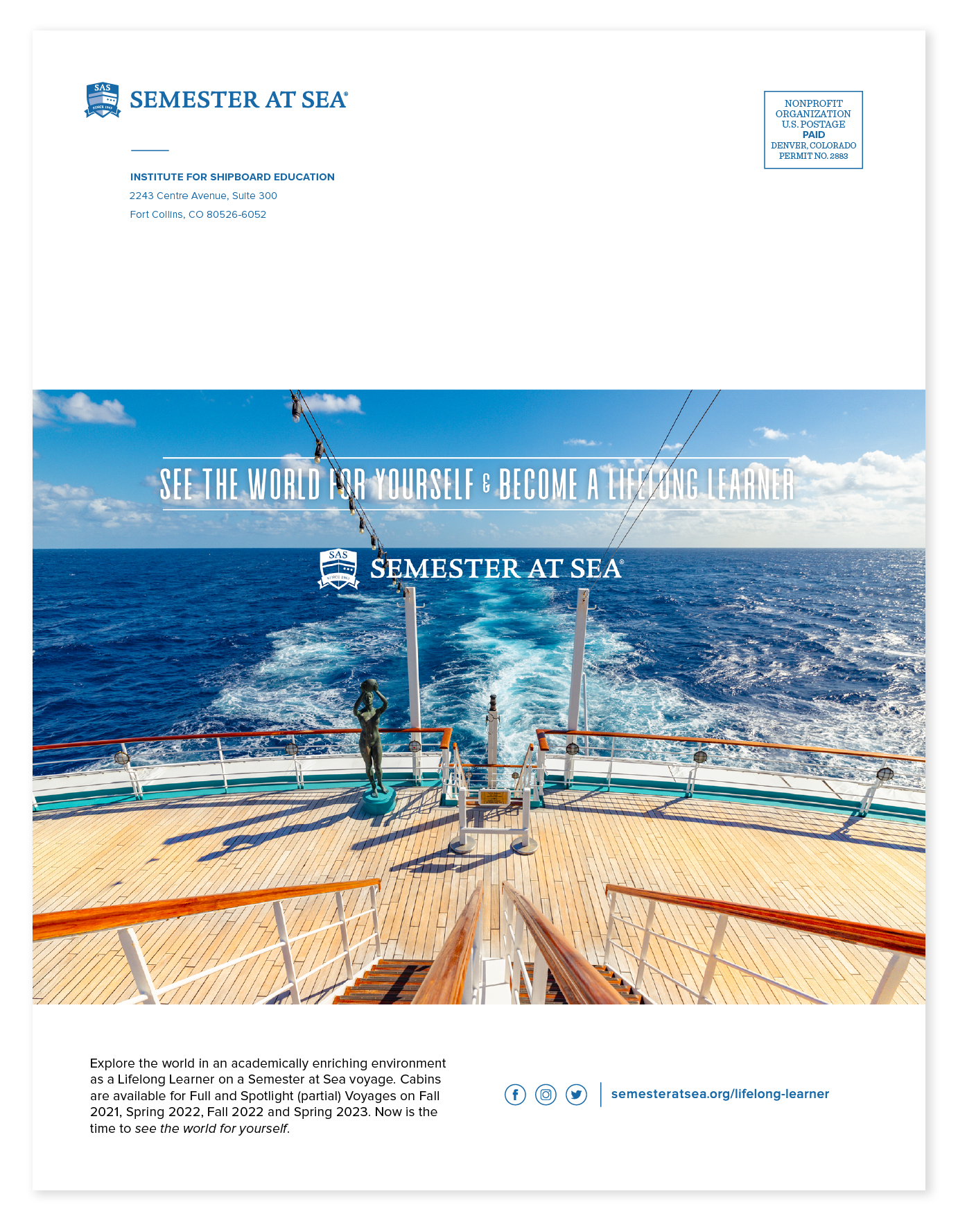
Back page magazine advertisement for Semester at Sea's Lifelong Learner program.
Postcard design for Semester at Sea's Lifelong Learner program that was sent to approximately 8,000 recipients. I used a 100 lb. cover weight and coated on the photo side, uncoated on the mailing side.
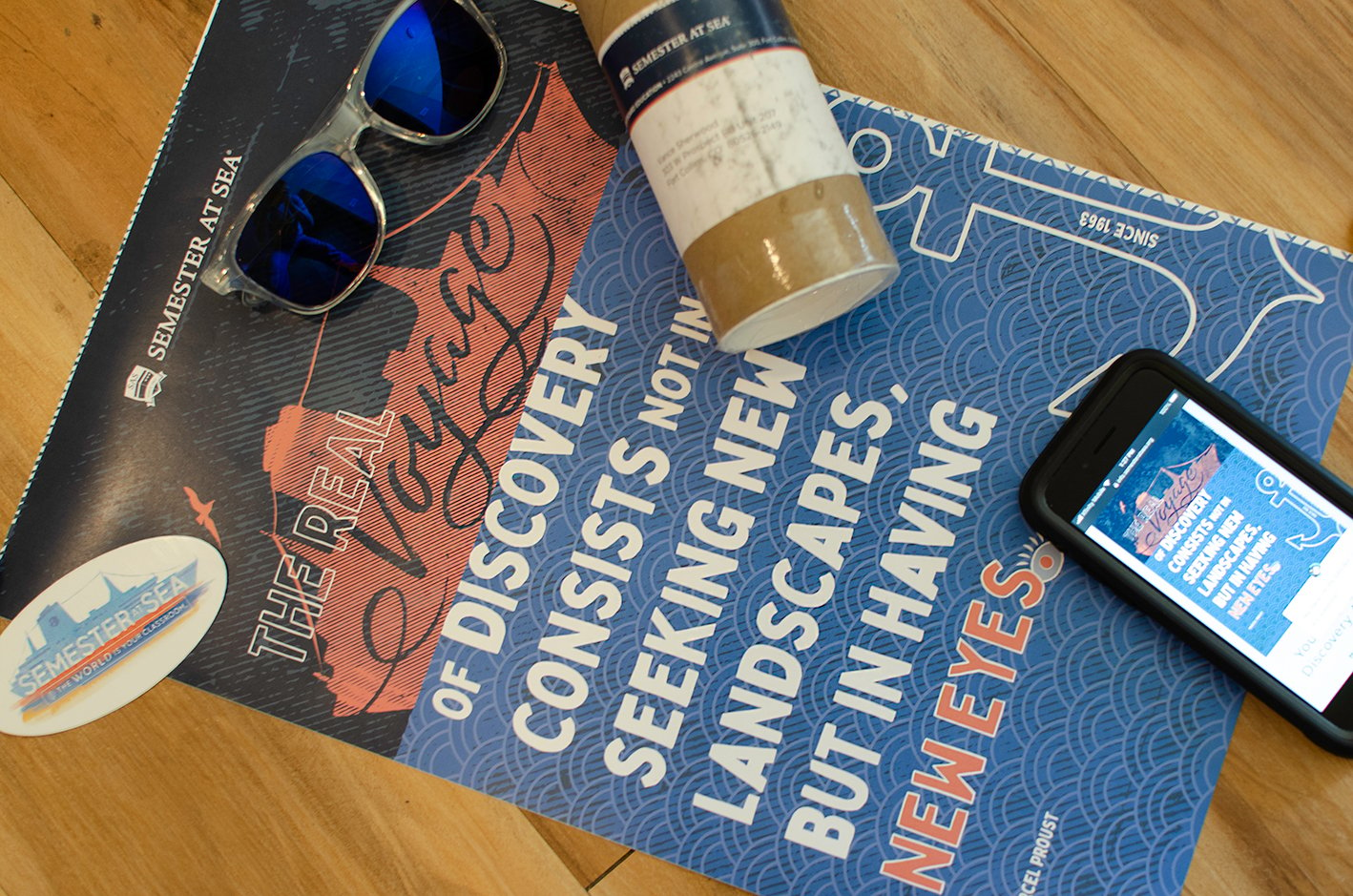
This project illustrates a creative concept that I developed into final production. The tube mailer was sent out to newly admitted voyagers. This includes: Personalized double-sided variable data poster (name and voyage), sunglasses, and sticker. The QR code on the back side of poster directs to a website landing page where the students can explore cabin (housing) options and pay their refundable deposit. This is tracked for the return on investment. The package will include a full social media campaign targeted to perspective voyagers. I worked with our distribution center on all of the logistics to get the best price for fulfillment as a package. Overall goal: To steward students that have taken the first step to be admitted to Semester at Sea and to get them through the following steps to deposit. A few small gifts function as a reminder of joining SAS. Dimensional mail feels special to the recipient.
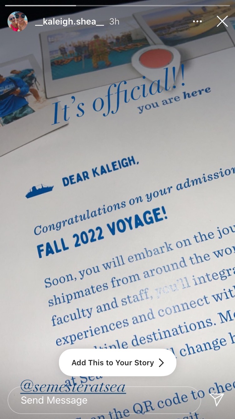
Our first tag on Instagram from the admitted student package.
This layout shows art direction working with a contract digital painter/illustrator. The direction was to keep the ship accurate but painterly and vivid, emphasizing our brand colors.
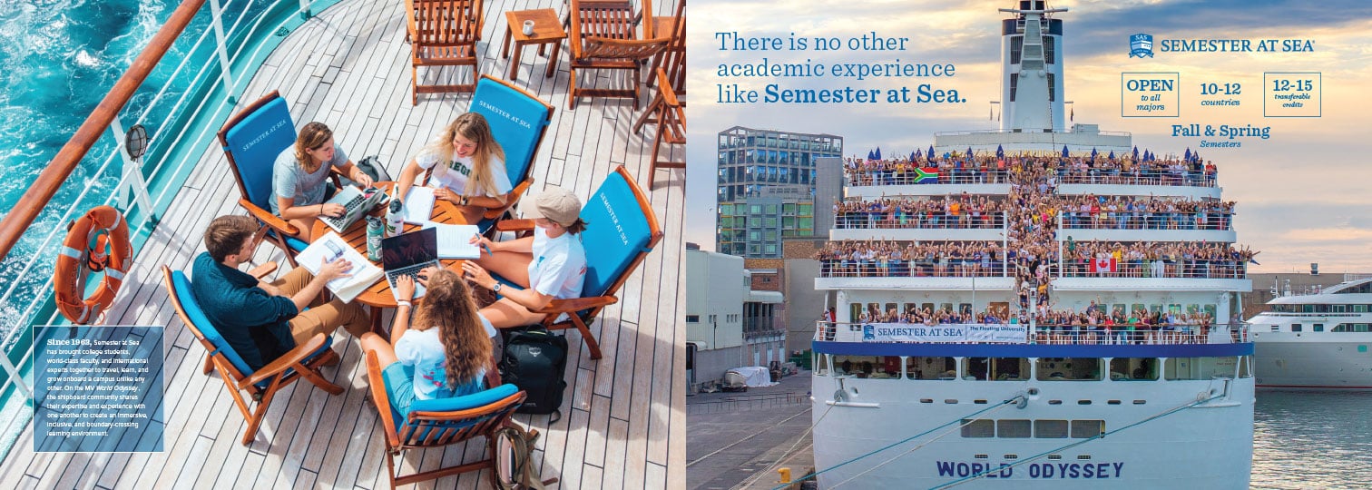
This shows design art direction with guiding the photographer for the "back of ship wave" and other positioning on the ship that tells our story visually.
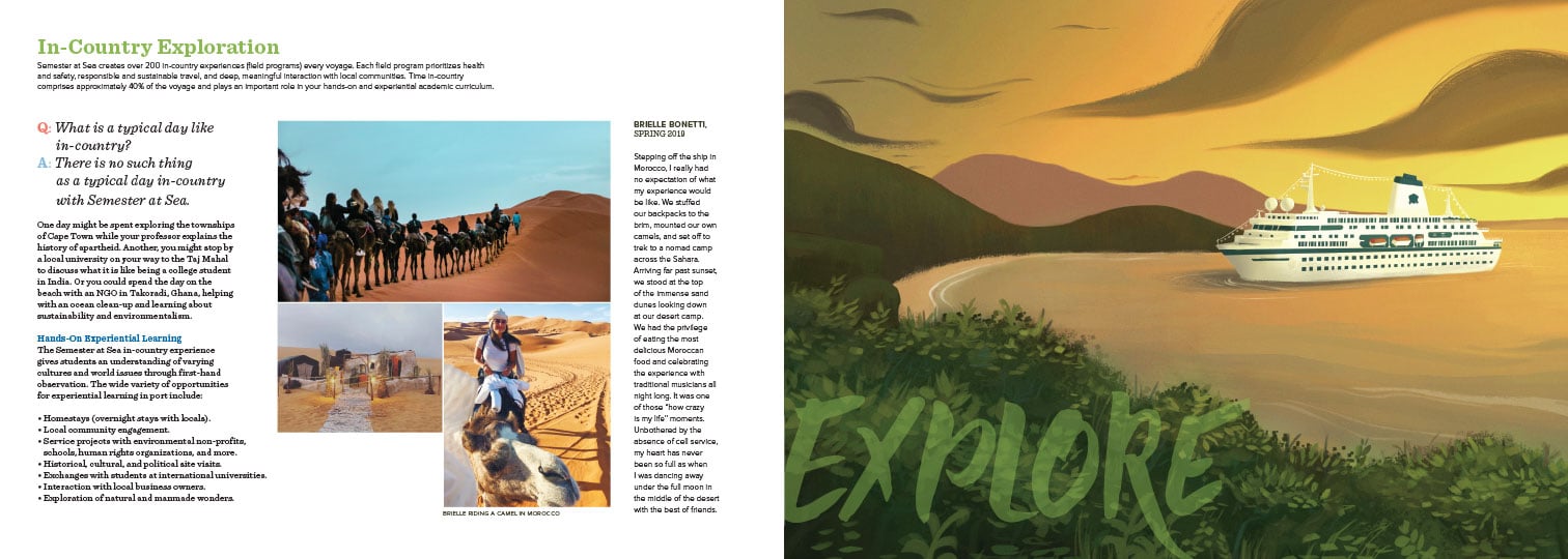
This layout shows another illustration that I art directed and gave photography references for. Storytelling lets the reader experience what other voyagers have experienced.
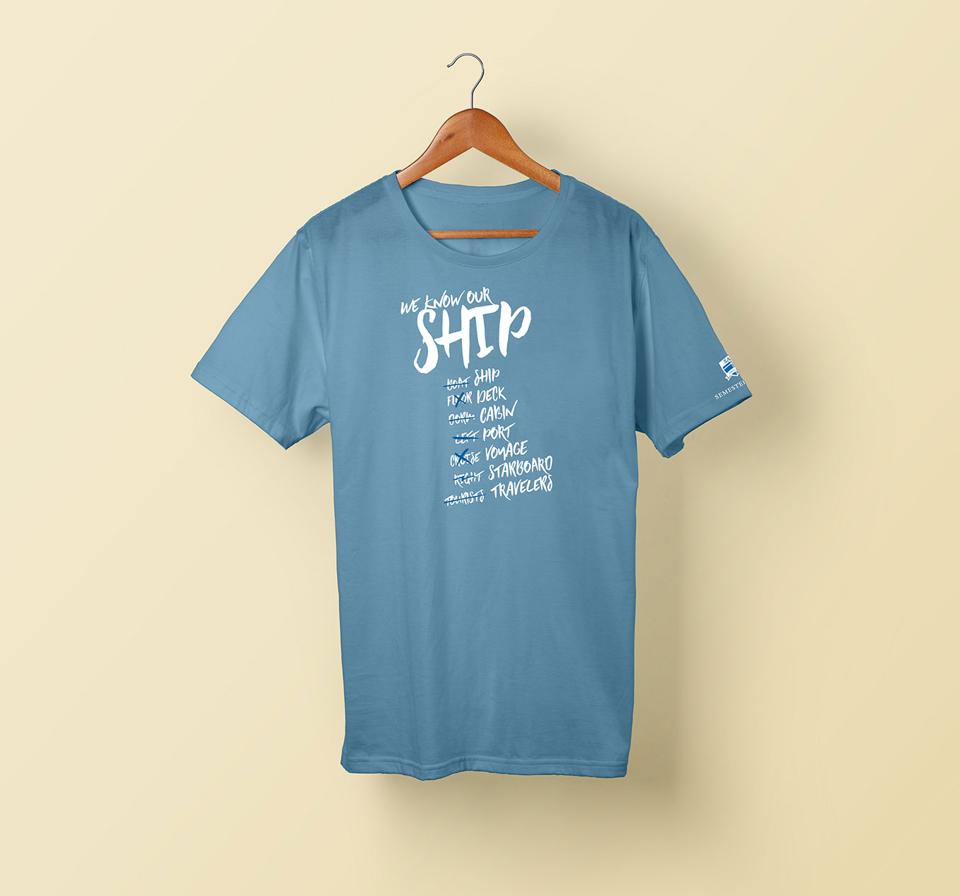
A Homecoming t-shirt design that voyagers received as part of registration.